



Cricut Design Space Fonts: System, Writing and Cutting
 Published
 Updated
Cricut Design Space fonts come from two places, and knowing which is which answers most font questions. Cricut fonts sit in the Cricut library and mostly require a Cricut Access subscription. System fonts are already installed on your computer and cost nothing. Design Space reads both from one dropdown.
Almost every font question in Design Space traces back to that split. Why some fonts show a small green A icon and others do not, why a font you installed yesterday is missing, why a font writes as a single line for one design and as an outline for another. None of it is random, and none of it is a bug.
This covers how the font list is built, what the Writing style actually does, which fonts cut well at small sizes, and where bought font files fit. Installing a font is an operating system job rather than a Design Space one, so everything here assumes the file is already on your computer.
Cricut Fonts Versus System Fonts
Cricut Design Space fonts hosted by Cricut appear in the font list whether or not you own them. Most are included with Cricut Access; the rest are sold individually, and Design Space will tell you at the point of cutting rather than at the point of designing. Choosing one, building a whole project around it, then discovering a charge at checkout is a rite of passage.
System fonts are the ones installed on your operating system. Design Space scans them at sign in and lists them alongside the Cricut ones at no cost. A font you bought from a foundry, downloaded free, or received inside a cut file bundle becomes a system font the moment you install it, and then behaves like any other.
The practical consequence is that you never have to pay Cricut for a font. Install what you want and use the filter to show system fonts only. What you do give up is the Writing style, which is covered below, and the guarantee that the font was drawn with a blade in mind. A cut ready font set solves the second problem without a subscription.
📐 Technical Note
Design Space reads system fonts at sign in, not continuously. Install a font while the program is open and it will not appear. Close Design Space fully, including from the system tray on Windows, and sign back in. On iOS the font has to be installed through a profile or a font manager app before it becomes visible at all.
What Does the Writing Style Actually Do?
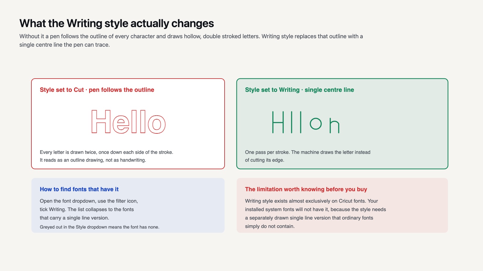
Writing style replaces the outline of each letter with a single center line that a pen can trace, so the machine draws the letter instead of cutting its edge.
Without it, a pen follows the outline of every character and you get hollow, double stroked letters that look like an outline drawing rather than handwriting. This single setting causes more confusion than anything else in Design Space, because the failure looks like a pen problem rather than a font problem.
To use it, select your text and change the Style dropdown in the top edit bar to Writing. If the option is grayed out, the font does not have a writing version. Cricut lets you filter for this: open the font dropdown, use the filter icon, and tick Writing to show only fonts that carry the style. Cricut’s own writing walkthrough describes the same route.
The limitation is significant: Writing style exists almost exclusively on Cricut fonts. Your installed system fonts will not have it, because the style requires a separately drawn single line version of the typeface that ordinary fonts do not contain. This is the one real argument for Cricut Access if you make cards, envelopes or written labels regularly.
📌 Did You Know?
Genuine single line fonts are a separate category of font file, originally developed for CNC engraving and plotter work rather than for printing. They contain open paths with no thickness at all, which is meaningless to a printer and exactly right for a pen or an engraving tip. That is why they are sold by specialist vendors rather than ordinary type foundries.

Which Fonts Cut Well, and Which Do Not
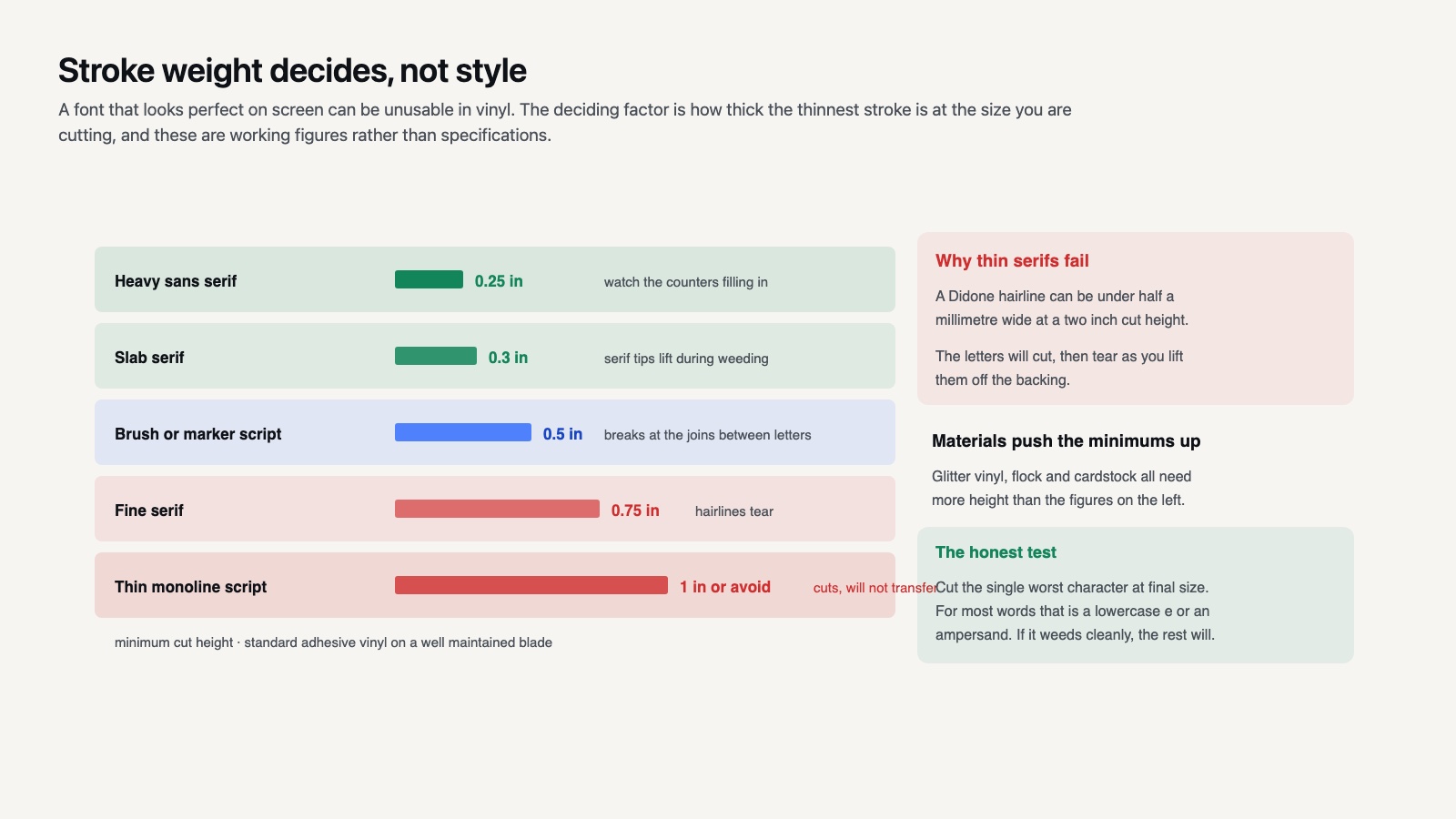
A font that looks perfect on screen can be unusable in vinyl, and the deciding factor is stroke weight relative to cut size rather than style.
Thin serifs are the classic failure. The hairline strokes in a Didone style serif can be under half a millimeter wide at a two inch cut height, which is thinner than the blade can reliably produce and far too fragile to weed or transfer. The letters will cut, then tear as you lift them.
Script fonts fail differently. The connecting strokes between letters are usually thinner than the letters themselves, so a script word cut at small size breaks at every join. Scripts also need welding, because unwelded connected letters cut as overlapping separate shapes with visible seams.
Fonts that reliably work are heavy sans serifs, slab serifs, rounded display faces and anything described as a marker or brush style with consistent stroke width. Novelty and character fonts are usually drawn heavy for exactly this reason, which is why our cartoon font sets cut cleanly at sizes where a delicate serif would not.
Stroke weight and minimum cut size
| Font style | Realistic minimum height | Main risk |
|---|---|---|
| Heavy sans serif | 0.25 in | Counters filling in |
| Slab serif | 0.3 in | Serif tips lifting |
| Brush or marker script | 0.5 in | Breaks at the joins |
| Fine serif | 0.75 in | Hairlines tear on weeding |
| Thin monoline script | 1 in or avoid | Cuts but will not transfer |
These are working figures for standard adhesive vinyl on a well maintained blade, not specifications. Glitter vinyl, flock and cardstock all push the minimums up, and the honest test is a half inch sample strip before you commit the sheet.
💡 Pro Tip
Before you commit to a font for a repeat product, cut the single worst character in your text at final size. For most words that is a lowercase e or an ampersand, because both have the tightest internal curve. If that one character weeds cleanly, the rest will.
Spacing, Welding and the Two Settings People Miss
Letter spacing in Design Space is a single slider that adjusts every gap equally, which is fine for capitals and wrong for scripts. Script letters need to overlap to look joined, and an even reduction will collide some pairs while leaving others apart.
The fix is to ungroup the text into individual letters and position them by hand, then weld. It is tedious and there is no shortcut, and it is the difference between a script word that looks typeset and one that looks designed. Cricut documents the weld function separately, and the same operation appears as grouping, attaching and welding depending on what you want to preserve.
The second missed setting is Attach. Weld merges shapes permanently into one path; Attach holds separate shapes in position without merging them. Use Weld for a script word that should cut as a single piece, and Attach for text that should keep its colors separate or be drawn with a pen. Welding text you meant to write destroys the writing style.
Curving, Stacking and Multi Line Text
Design Space added a Curve slider that bends a text object along an arc, and it is the fastest way to get lettering around a circle for a tumbler design or a round monogram.
It has one behavior that catches people out: curving is applied to the text object as a whole, so you cannot curve part of a line, and once you convert the text to a cut path the curve is baked in permanently. Set the curve before you weld, never after.
Multi line text is handled by pressing return inside the text box rather than by creating separate objects, and line spacing gets its own slider next to letter spacing. Separate text objects stacked by eye will drift out of alignment as soon as anything is resized, which is the single most common reason a two line design comes off the mat crooked.
For lettering that needs to sit on a shape rather than an arc, there is no path type tool. The workaround is to curve approximately, then ungroup and nudge, which is the same manual process scripts need. It is worth knowing this limit before you design a project around it, because no setting will produce text flowing along an arbitrary curve.
Where Do Bought Font Files Fit?
Fonts sold with cut file bundles arrive in one of two forms, and they behave completely differently.
An installable font file, OTF or TTF, gets installed to your operating system and then appears as a system font in Design Space. You type with it like any other font, and you can resize and respace freely. This is the more flexible form.
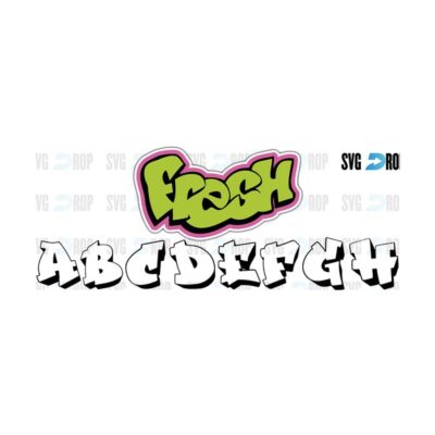
An SVG alphabet is a set of vector letters drawn as shapes, delivered as a cut file rather than a font. You place letters individually rather than typing them. It is more work per word, and the letters are usually drawn specifically for cutting, with thickened strokes and cleaned up joins that no installable version of that style would have. For layered or multi color lettering, an SVG alphabet is often the only form that works at all, since a font file carries one color by definition.
Character and brand style fonts deserve a specific caution here. Logos, wordmarks and the characters associated with them are protected by copyright and trademark regardless of what file format you hold them in, and a lookalike font is a separate work from the mark it imitates. Using one on a personal gift is not the same permission as selling a product with it. Checking the license before you list is the seller’s responsibility. The USPTO trademark basics pages set out what the protection covers.

Fixing a Font That Will Not Show Up
Four causes account for nearly all reports of Cricut Design Space fonts going missing, in order of how often they turn out to be the answer.
Design Space was open when you installed it, so restart and sign back in. The font is installed for one user account only on Windows, so reinstall for all users. The font is a variable or web format that the operating system accepted but Design Space cannot read, so install the static OTF or TTF instead. Or you are filtering the list to Cricut fonts only, which hides everything you own.
On mobile the answer is different and less satisfying. Design Space on iOS and Android reads a much more limited set of system fonts, and font installation on those platforms is awkward by design. Anyone working mainly from a phone or tablet is realistically limited to Cricut fonts plus whatever the device ships with, and building type heavy projects on a desktop then opening them on mobile is the usual workaround.
If a font shows up but renders with boxes or missing characters, the file is incomplete rather than broken. A lot of free display faces ship with capitals and numerals and nothing else. Cricut maintains a font language support page covering which character sets its own fonts include, which is the same question in a different form for anyone setting text in a language other than English.
The broader habit worth building is treating fonts as project assets rather than as a menu. Keep the original files with the designs they belong to, note which ones are licensed for commercial use, and test each new one at your smallest working size before it enters the rotation. That saves rediscovering the same limitation every few months, and it is the same discipline that makes the rest of Design Space predictable rather than surprising.